I want to walk you through a practical framework I use whenever analytics start to pile up into a noise-filled spreadsheet and the product team asks: “What should we test next?” The core idea is simple: focus on three reliable analytics signals, convert them into clear hypotheses, and rank experiments by expected impact so your UX tests actually move metrics. I’ll show the exact signals I prioritize, how I turn them into testable ideas, and the lightweight prioritization and tracking I use to keep the backlog actionable.
The three signals I rely on
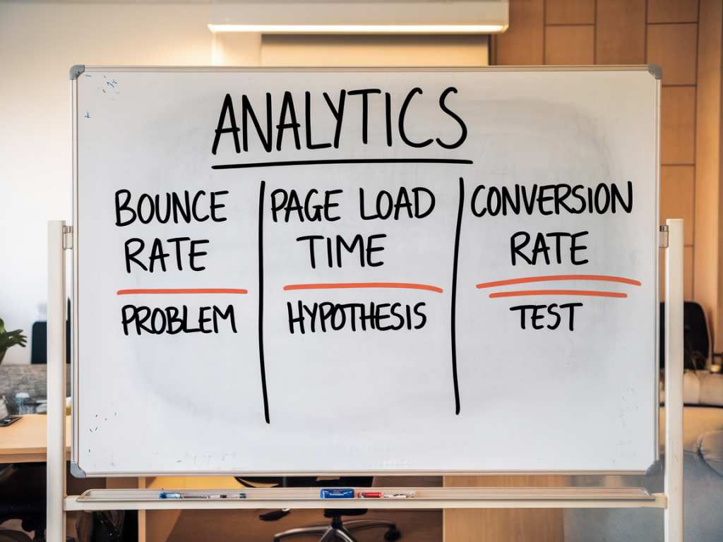
Over the years I’ve tried dozens of metrics, but three signals consistently reveal UX opportunities that are both meaningful and testable. They’re not mystical — they’re the ones that most directly connect user behavior to business outcomes.
Each signal gives you a different vantage: funnel drop-offs tell you where revenue or key goals leak; micro-conversions show weak levers that could be optimized; behavioral friction points reveal UX irritants that erode trust and completion rates.
How I translate a signal into a hypothesis
Turning raw data into a testable hypothesis requires a small mental checklist. I ask:
Here’s a formula I use to write hypotheses:
If [change we’ll make], then [measurable outcome] for [segment of users], because [rationale grounded in the signal].
Example from a checkout funnel:
If we reduce the number of form fields from 7 to 4, then checkout completion rate will increase by X% for mobile users, because funnel analytics show a 38% drop on the payment step and heatmaps show high abandonment on the form area on mobile.
Prioritizing tests: impact, confidence, ease
There are many frameworks to prioritize experiments (RICE, ICE, PIE). I like a compact ICE approach — Impact, Confidence, Ease — because it’s fast and grounded in the signals we already gathered.
| Criterion | How I estimate it |
|---|---|
| Impact | Estimate potential lift using current conversion numbers. If a step has 10k monthly users and a 20% drop, a 10% relative improvement is tangible. |
| Confidence | Based on data quality: sample size, consistency across sources (analytics + heatmaps + support tickets), and whether there's qualitative user feedback. |
| Ease | Engineering effort, design complexity, QA and tracking — quick wins score high. |
I score each candidate from 1–10 on these dimensions and calculate ICE = (Impact × Confidence) / Ease. That ranking gives me a short list of experiments likely to move the needle quickly.
Practical examples: from signal to prioritized backlog item
Here are three real-world patterns and how I convert them into backlog items.
Evidence: Analytics show a 45% drop between “create profile” and “connect account.” Session recordings reveal users are confused by the “Connect” screen text.
Hypothesis: Simplify the copy and add inline visual examples explaining why connecting an account is valuable — this will increase completion by X%.
ICE estimate: Impact 8, Confidence 7 (multiple recordings), Ease 6 (copy + small UI tweak) → prioritized high.
Evidence: Only 3% of users click the 'Try feature' CTA. Heatmaps show users ignore its location.
Hypothesis: Move the CTA into the primary toolbar and add a tooltip for first-time users — this will raise click-through to 8%.
ICE estimate: Impact 6, Confidence 6, Ease 8 → medium-high priority.
Evidence: Error events show clicks that trigger nothing. Users expect a link but it's decorative.
Hypothesis: Convert hero image into an accessible, tappable element that navigates to the intended content or remove affordance — reduce confusion and increase downstream content views.
ICE estimate: Impact 5, Confidence 9, Ease 9 → high priority for a UX fix.
Designing the experiment and metrics
Once an item is prioritized, I define:
I aim for experiments that run long enough to capture natural user cycles but short enough to fail fast. For most product teams that means 2–4 weeks with a clear MDE or stopping rules defined.
Keeping the backlog actionable
A backlog is only useful if items are ready to run or clearly staged. I use simple states:
Each backlog card includes: signal evidence (screenshots, links to analytics), hypothesis (clear sentence), targeted metric, ICE score, and implementation notes. That way stakeholders can see why we chose a test without diving into raw dashboards.
Tools and small processes that keep tests honest
I lean on a few lightweight tools:
And a few processes:
When you consistently turn those three signals into specific, prioritized experiments, something subtle happens: the backlog shifts from a pile of “good ideas” into a focused engine for metric improvement. You stop testing the cute idea of the week and start validating the things that actually move your product forward.