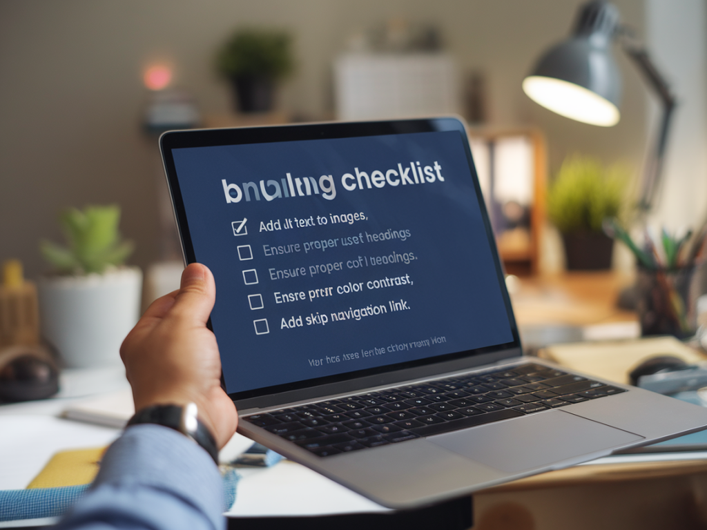
I’m going to walk you through a practical, step-by-step checklist to make your website accessible — and I’ll show you how to do it without breaking your carefully crafted layout. Accessibility doesn’t have to mean sacrificing design. In fact, accessibility often improves clarity and resilience across devices. Below are the tactics I use on real projects to keep layouts intact while making interfaces inclusive.
Start with semantic HTML
The foundation of accessibility is the right HTML structure. If you get semantics right, many assistive technologies will behave predictably and your layout will remain stable.
- Use proper elements: <header>, <nav>, <main>, <article>, <section>, <aside>, <footer> — these give screen readers landmarks and skip repetitive navigation.
- Prefer <button> to clickable <div>: Buttons are focusable and announce their role to assistive tech automatically. If you need a custom-styled control, start with <button> and style it.
- Headings hierarchy: Keep a logical H1 → H2 → H3 order. Don’t skip levels for visual effect — use CSS to style headings instead.
- Label form controls: Always pair <label for="..."> with inputs or use aria-label and aria-labelledby only when necessary.
Color and contrast without changing your palette
Designers often fear that improving contrast will break the visual identity. You can preserve brand colors while meeting contrast requirements.
- Test contrast early: Use tools like Contrast Checker from WebAIM or the contrast tool in Figma to evaluate text and UI elements. Aim for WCAG AA at minimum (4.5:1 for normal text).
- Use layered approaches: If brand color fails contrast, add a subtle dark overlay behind text, or use semi-transparent backgrounds (rgba or linear-gradient) to increase contrast without changing the hue.
- Introduce a second accessible color: Keep the primary brand color for decorative accents and introduce an accessible variant for important text/buttons.
- Don’t rely on color alone: Add icons, patterns, or labels to convey state (error, success, required).
Keyboard-first interactions
Make sure everything interactive works via keyboard — that’s essential for many users and a good guardrail for robust layouts.
- Tab order: Natural DOM order should match the logical tab order. Avoid reordering focus with positive tabindex values.
- Visible focus states: Provide clear focus styles. If you remove default outlines for visual reasons, replace them with a conspicuous alternative (box-shadow, outline-offset).
- Keyboard controls for custom widgets: If you build custom dropdowns, sliders, or modals, implement standard keyboard patterns (arrow keys, Esc to close, Enter/Space to activate).
- Trap focus inside modals: Use focus traps so keyboard users don’t get lost. Returning focus to the triggering element after closing is a small detail that feels polished.
ARIA — use it wisely
ARIA can help but it’s not a substitute for semantic HTML. Use ARIA only when native semantics are insufficient.
- Prefer HTML first: Native elements like <button>/<nav> are better than applying role attributes to non-semantic elements.
- Common ARIA patterns: role="dialog" + aria-modal, aria-expanded for collapsible regions, aria-live for dynamic content updates.
- Avoid redundant ARIA: Don’t add role="button" to a <button>. It’s unnecessary and can cause confusion.
- Test ARIA with screen readers: ARIA can behave differently across platforms — always verify with actual assistive tech.
Responsive layout strategies that preserve accessibility
Responsive CSS doesn’t conflict with accessibility — it supports it. Use techniques that keep elements readable and reachable at all sizes.
- Fluid typography: Use clamp() or responsive units (vw, rem) to avoid tiny text on small devices.
- Accessible breakpoints: Reflow content rather than hide it. If a menu collapses to a hamburger, ensure the expanded state is keyboard-navigable and announced.
- Avoid absolute positioning for interactive items: Absolute positioning can remove elements from the natural DOM flow, creating tab-order surprises. Use CSS Grid/Flexbox for layout stability.
- Maintain hit target sizes: Keep tappable areas large enough (at least 44–48px) so users with motor difficulties don’t miss them.
Images, media, and content alternatives
Images and multimedia should include textual alternatives so screen reader users understand your content.
- Alt text: Provide concise, meaningful alt attributes. Decorative images can use alt="".
- Captions and transcripts: Add captions to videos and transcripts for audio content. Platforms like Vimeo and YouTube provide captioning tools; self-hosted videos should include WebVTT.
- Responsive images: Use <picture> and srcset so the right image size loads without harming layout or accessibility.
Animations and motion
Motion can add personality, but it can also trigger vestibular disorders. Offer reduced-motion options without stripping the design.
- Respect prefers-reduced-motion: Use media queries to reduce or disable non-essential animations for users who opted out.
- Keep animations short and purposeful: Avoid long entrance animations that delay content access.
Forms that don’t break when made accessible
Forms are where accessibility and layout often clash, mostly because of labels, validation, and error handling. Here’s how to reconcile them.
- Labels and placeholders: Don’t use placeholders as the only label. Place labels persistently or use floating labels that keep the label visible when the user types.
- Error messages: Provide inline errors with aria-describedby linking the input to the message. Use clear, constructive language and show error icons as well.
- Group related controls: Use fieldset & legend for radio groups and checkboxes so they’re announced as groups.
Testing checklist — automated + manual
Automated tools speed up detection, but manual testing finds real-world issues. I run both on every project.
- Automated scanners: Run Axe (browser extension), Lighthouse (Chrome DevTools), and WAVE to catch common issues.
- Contrast checks: Use the Contrast tool in Figma for design files and WebAIM for live pages.
- Keyboard-only navigation: Try to use the entire site with only the keyboard. Can you access menus, forms, and dialogs? Is focus visible?
- Screen reader testing: Test with VoiceOver (macOS/iOS), NVDA and JAWS (Windows). Listen for logical announcements, meaningful image descriptions, and correct role labeling.
- Reduced motion: Toggle prefers-reduced-motion in system settings to ensure animations respect the preference.
- Mobile and responsive checks: Use device emulators and real devices to verify layout and tap targets.
- Real user feedback: When possible, incorporate feedback from people who use assistive technologies — it’s the most valuable testing you can do.
Small patterns that make a big difference
These are practical tweaks I add near the end of projects that often get overlooked but significantly improve accessibility without breaking design.
- Skip link: Add a hidden "Skip to content" link that becomes visible on focus for keyboard users.
- Accessible icons: Use aria-hidden="true" for decorative SVGs and provide text alternatives for meaningful icons.
- Maintain focus order when using CSS transforms: CSS transforms can confuse where elements appear visually vs. in the DOM. Double-check tab order and consider avoiding transforms that change stacking contexts for interactive controls.
- Progressive enhancement: Build basic functionality first; layer JS enhancements on top. This keeps core interactions accessible even if JS fails or is disabled.
Tools and resources I use
Here are the utilities I reach for when auditing and fixing accessibility issues:
- Axe DevTools (browser extension)
- Lighthouse (Chrome DevTools)
- WebAIM Contrast Checker
- WAVE Evaluation Tool
- VoiceOver (macOS/iOS), NVDA (Windows)
- Figma plugins: Stark for contrast and color-checking
Accessibility doesn’t require reinventing your layout — it requires thoughtful choices at every layer: semantic HTML, smart CSS, sensible JS, and robust testing. If you adopt the checklist above, you’ll keep your visual design intact while making your site usable for many more people. If you want, I can generate a printable checklist or a lightweight audit template you can apply to your next project.