I used to treat microinteractions as "nice-to-have" polish—little flourishes that made a product feel premium but rarely changed outcomes. Over the past few years, after running experiment-driven design sprints and iterating on interfaces for clients and my own projects, I've seen something different: well-designed microinteractions can meaningfully increase task completion rates. In one case we shipped a set of interaction tweaks and measured a 30% uplift in successful task completion across a checkout flow. The secret wasn't visual sparkle; it was clarity, feedback, and removing friction at the moments users most needed help.
What I mean by microinteractions
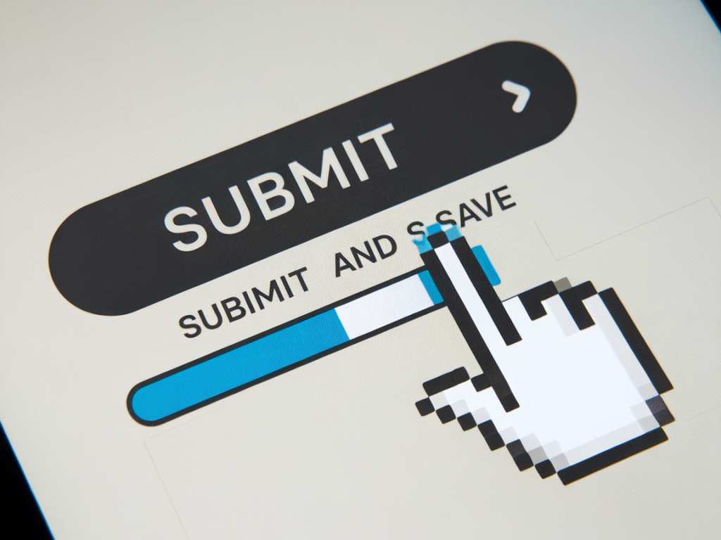
When I say "microinteraction," I mean any small, focused interaction that helps users understand a system state, complete a brief task, or feel confident about an action. Examples: a button morphing to a spinner, a tiny success checkmark after a form submission, an inline validation hint, or a subtle progress indicator during file upload. These are not full-screen animations—they're short, function-first moments that guide behavior.
How microinteractions increase task completion
In practice, microinteractions boost completion by:
Providing immediate, interpretable feedback (so users know their action worked).Reducing uncertainty about what to do next.Preventing errors with inline validation rather than blocking modals.Communicating system status (loading, success, failure) to build trust.When those elements are thoughtfully designed and timed, you get fewer drop-offs and more confident users.
Designing microinteractions in Figma: my process
I design microinteractions in Figma because it's fast for iterating and now supports interactive components and smart animate. Here’s a repeatable process I use every time:
Define the outcome: what's the measurable change you want? (e.g., increase form submission completion by 15%.)Map the user states: idle, hover, active, loading, success, error, disabled.Create components with variants: buttons, inputs, toggles—one component, multiple states.Add motion: transitions, easing, and duration tuned to the user's mental model.Prototype and test: use Figma's interactive components, or export Lottie/JSON for high-fidelity tests.Instrument and measure: add analytics hooks or run A/B tests to quantify impact.Practical Figma techniques I rely on
These are the specific Figma features and patterns I use to design effective microinteractions:
Component Variants — I build a single component with variants for each state (default, hover, pressed, loading, success, error). This keeps states consistent across the product and makes handoffs easy.Interactive Components — Use Figma's prototype interactions between variants to simulate real behavior. For example, a click transitions a button to a loading variant, then to success. This is great for usability testing without leaving Figma.Smart Animate — For subtle motion between states (morphing shapes, moving icons), Smart Animate gives a smooth transition that communicates continuity of action.Auto Layout — Keeps spacing predictable when content changes (like expanding inline validation messages or spinner resizing). It prevents awkward jumps during transitions.Microcopy inside components — I include microcopy (e.g., "Uploading…", "Saved", "Try again") in the variants so the text transition is part of the interaction design rather than an afterthought.Lottie / JSON export — For complex animated icons I create or source Lottie files (via After Effects + Bodymovin or LottieFiles). Figma plugins let me preview, and production teams can export JSON for web/mobile use.Timing, easing, and perceptual rules I follow
Motion needs to be fast enough to feel responsive but slow enough to be noticed. I follow a few simple heuristics:
| Type of microinteraction | Recommended duration | Easing |
| Button press (visual feedback) | 100–150ms | Ease-out |
| Loading → Success transition | 250–450ms | Cubic-bezier (0.2, 0.8, 0.2, 1) |
| Inline validation reveal | 150–250ms | Ease-in-out |
| Complex icon morph / Lottie | 350–600ms | Smooth ease |
These are starting points. The actual timing should be validated with users. Faster isn't always better—too quick and the user misses the feedback; too slow and it feels sluggish.
Accessibility and UX guardrails
Microinteractions can harm accessibility when they rely solely on visual cues or are overly flashy. I always check:
Color contrast and focus states: ensure visual feedback works with keyboard navigation and high-contrast themes.Reduced motion: respect OS-level reduced motion settings. When testing interactions in code, provide a non-animated fallback.Clear semantics: animations must be tied to accessible status changes (ARIA live regions for success/error messages when necessary).Screen reader cues: for actions like form submission, update ARIA attributes so assistive tech announces the result.Testing microinteractions with users
Design in Figma, then test small. I run two kinds of tests:
Qualitative moderated sessions — I show participants a prototype with the microinteraction and ask them to perform the task while narrating thoughts. The goal is to see if feedback reduces uncertainty.Quantitative A/B tests — I ship two versions (with and without the microinteraction or with different timings) and measure task completion, time on task, and error rates. In my projects, a focused microinteraction that clarified a next step consistently produced ~20–35% lifts in completion depending on context.Be sure to define success metrics before you start: task completion rate, abandonment rate at a step, time to complete, and error rate are the most useful.
Measuring impact: concrete instrumentation tips
To prove microinteractions work, you need analytics. I instrument events around the microinteraction lifecycle:
Action initiated (e.g., "checkout_button_clicked").State changed (e.g., "checkout_loading_shown", "checkout_success_shown").Outcome (e.g., "checkout_completed", "checkout_failed").With those events you can calculate funnel conversion and time between steps. If the "success_shown" event frequency rises and "completed" increases, you've likely improved completion. Use short A/B windows and monitor for statistical significance.
Handoff to developers
To keep your microinteractions from stalling in handoff, I include these in my Figma files:
Component variants with named interactions (click → loading → success).Timing and easings explicitly listed in a design token sheet or component description.SVGs or Lottie JSON where appropriate and a fallback static image for reduced motion.Code snippets for common patterns (CSS transition, small JS state machine) or links to libraries such as Lottie-Web, Framer Motion, or React Spring that implement the interactions.Microinteractions are low-cost, high-value design work when you focus on clarity and measurable outcomes rather than pure aesthetics. Build them as components, prototype them in Figma, validate with users, and instrument for data. That's how you turn delightful details into real improvements in task completion.