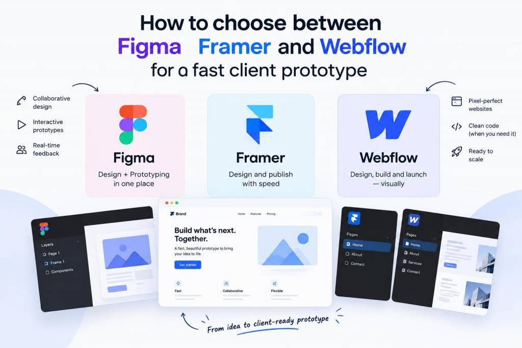
When I need a fast client prototype, I usually do not start by asking which tool is “most powerful.” I start by asking what the client actually needs to see, feel, and approve. That one question changes everything. A prototype is not a finished product, and it is not a portfolio piece. It is a decision-making tool. If I choose the wrong platform, I can waste hours polishing details that do not help the client decide. If I choose the right one, I can move from concept to feedback with very little friction.
For me, Figma, Framer, and Webflow each solve a different problem. They overlap in some places, but they are not interchangeable. I have learned that the fastest option depends on what kind of client conversation I want to trigger. Sometimes I want to test structure and hierarchy. Sometimes I want to show motion, interactivity, and a more realistic product feel. Sometimes I want to hand over something that looks nearly production-ready and can evolve into a real site with minimal rework.
What I try to learn before I open any tool
I begin by separating speed from clarity. A prototype can be quick and still fail if it does not answer the right questions. Before I choose a platform, I think about four things: the client’s comfort with feedback, the level of realism needed, the amount of interaction required, and whether the work might later become a live site. Those four factors usually point me toward one tool much more clearly than any feature list.
If the client mainly needs to react to layout, content flow, or product logic, I lean toward Figma. If the client needs a more immersive and polished experience, I look at Framer. If the goal is to create a responsive marketing page that may later ship as the real site, Webflow becomes more attractive.
I have also learned that deadlines can be misleading. A “fast” prototype is not always the one I can build the quickest from scratch. Sometimes the fastest path is the one that reduces revisions later. A tool that saves twenty minutes today but creates a week of confusion tomorrow is not actually fast.
Why I still reach for Figma first in many cases
Figma is still my default when I need to explore structure and direction quickly. It is very strong for early-stage thinking because it lets me move from wireframe to polished mockup without changing environments. I can sketch ideas, refine hierarchy, and present a clear visual story in one file. For many clients, that is enough to get meaningful feedback.
I like Figma because it is easy to keep the process collaborative. Clients can comment directly on frames, compare options, and respond without learning a new system. That matters a lot when I am working with people who do not live inside design tools every day. If I need to explain a navigation pattern, a homepage layout, or a dashboard structure, Figma keeps the conversation focused.
Figma also works well when I need multiple directions fast. I can create several concepts side by side and let the client react to broad choices instead of getting trapped in a single polished path too early. In my experience, this reduces attachment to details that may change anyway.
That said, Figma has limits. It is not the tool I choose when the prototype needs to feel like a live website with real transitions, scroll effects, or production-like interactions. I can fake some of that, but I would rather not build a theatre set if I need a moving experience.
When Framer becomes the smarter choice
I turn to Framer when the client needs motion, responsiveness, and a sense of “this already feels real.” Framer gives me a stronger bridge between design and live interaction. It is especially useful when the prototype needs to impress stakeholders, support a pitch, or demonstrate a more emotional brand experience.
What I like most is that Framer can make small ideas feel vivid. A simple hero section, a card interaction, or a page transition can carry a lot of weight when the client is trying to imagine the final product. I have found that Framer is excellent for landing pages, campaigns, startup launch pages, and concept demos where movement is part of the message.
Framer is not always my first choice for raw ideation, though. I do not reach for it if I am still debating structure, content order, or information architecture. It is better once I already know the direction and want to raise the emotional and interactive quality of the prototype. If I try to use it too early, I can end up spending time on visual refinement before the strategy is ready.
Another reason I choose Framer is client perception. Some clients react much more strongly to a prototype that feels close to a live experience. That can be helpful, because it makes abstract discussions concrete. But it can also be dangerous if the client starts judging unfinished content as if it were final code. I use Framer carefully when I want realism without inviting confusion about scope.
Where Webflow fits into my process
Webflow is the tool I choose when the prototype is close to a real website and responsiveness matters a lot. If I know the project may move into production soon, Webflow can save me from rebuilding the same structure later. It is especially useful for marketing sites, brand pages, small business websites, and content-driven experiences that need to look good across breakpoints.
I like Webflow when the prototype needs to behave like a site rather than a design mockup. It is strong for layout control, responsive structure, and content management thinking. When I build in Webflow, I am often already considering spacing systems, component reuse, and the realities of launch. That makes it a great choice for clients who want something tangible and closer to deployment.
Still, Webflow is not always the fastest tool for early-stage client alignment. If I am still exploring several directions, I usually find Figma easier. Webflow becomes faster once the concept is stable. If I jump into Webflow too soon, I may spend time solving implementation details that the client is not ready to decide yet.
I also notice that Webflow works well when the client or their team will eventually take over the site. A prototype in Webflow can double as a practical foundation, which helps with handoff and reduces translation errors between design and development.
The way I compare them in real projects
When I am deciding between these three, I look at the project through a practical lens. I ask myself what kind of feedback I need, how soon I need it, and what the next phase will be. That usually makes the choice obvious.
| Tool | Strongest use case | Speed advantage | Client impression | Main weakness |
|---|---|---|---|---|
| Figma | Early concepts, structure, UX flow | Very fast for ideation and revisions | Clear, collaborative, familiar | Limited realism for interaction and motion |
| Framer | Interactive demos, polished presentations | Fast for realistic prototypes | Modern, impressive, immersive | Can be overkill for early exploration |
| Webflow | Responsive marketing sites, near-launch builds | Fast once structure is settled | Serious, production-oriented, tangible | Less efficient for loose concept work |
The questions I ask before I choose
I have a short mental checklist that usually leads me to the right tool:
- Do I need feedback on layout and flow, or on motion and realism?
- Will the client review this inside a design conversation, or as if it were nearly live?
- Is this a one-off prototype, or a foundation for a future site?
- Do I need multiple directions, or one convincing path?
- How much time do I want to spend on interaction details versus content clarity?
If most of my answers point toward structure and iteration, I choose Figma. If they point toward presentation and realism, I choose Framer. If they point toward responsive implementation and future launch work, I choose Webflow.
That sounds simple, but it took me time to learn. Early in my process, I often picked a tool because I liked working in it, not because it was right for the project. That is a subtle mistake. A personal preference is not the same as a production decision. Now I try to separate my creative appetite from the client’s actual needs.
What usually slows a prototype down
The tool is only part of the equation. I have seen fast projects become slow because the content was unclear, the approval chain was too large, or the scope kept changing midstream. No platform can fix a vague brief. In fact, a polished tool can sometimes hide those problems for a while and make them worse later.
One of the biggest time drains is building too much detail before the direction is approved. I try to avoid that by matching the fidelity level to the decision at hand. Figma helps me stay loose when needed. Framer helps me prove a feeling. Webflow helps me prepare for reality. When I force one of them to do all three jobs, the process slows down.
I also pay attention to how the client thinks. Some clients need to see something highly realistic before they feel confident. Others become distracted by polish and miss the core idea. In those cases, I intentionally keep the prototype simpler so the discussion stays focused on content, user flow, and business goals.
The choice I make when time is very short
When time is extremely limited, I usually start in Figma unless I already know the project needs motion or a near-live feel. Figma gives me the fastest route from blank page to meaningful review. From there, I can decide whether the concept deserves a second pass in Framer or a build-out in Webflow.
That staged approach saves me from making a big commitment too early. It also gives the client a cleaner experience. Instead of forcing one tool to cover every stage, I use each platform for what it does naturally well. That approach has helped me deliver faster without sacrificing quality.
In practice, my decision often looks like this: Figma for discovery, Framer for persuasion, Webflow for delivery-oriented prototypes. Once I started thinking in those terms, my workflow became much more efficient, and my client conversations became easier to steer.