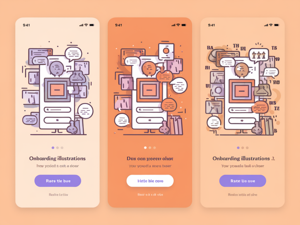
Onboarding illustrations are often treated as decorative afterthoughts. But when designed and tested with intent, they can guide attention, reduce friction, and nudge new users closer to activation. I've found that a lightweight, data-informed approach—a three-variant visual test combined with a handful of simple metrics—lets you iterate fast and learn what actually moves the needle.
Why test illustrations at all?
Illustrations are more than aesthetics. They communicate tone, clarify intent, and set expectations. A well-crafted onboarding image can reduce cognitive load, support microcopy, and even prime users for the next action. But equally, an illustration that’s confusing, too abstract, or mismatched with your product’s voice can distract or deter newcomers.
Rather than guessing which illustration will perform best, I prefer to run a small experiment. The goal isn’t to find the "perfect" art direction once and for all—it's to discover which visual cues help users understand value quickly and complete the activation flow.
The three-variant visual test: what and why
I use three variants because it balances speed, signal, and actionable insight:
- Variant A — Literal/Instructional: A clear, utilitarian image that depicts the product or the core action (e.g., a screen mock showing the primary feature). This prioritizes clarity over charm.
- Variant B — Emotional/Brand-led: A stylized, character-driven illustration that communicates tone, community, or benefit rather than mechanics.
- Variant C — Abstract/Metaphoric: A visual metaphor or abstract system that hints at benefits (growth, speed, simplicity) with shape, motion, or color.
Why three and not two? With two variants you can learn which of two performs better, but you often miss the middle ground. Three gives you a clearer signal about the dimension that's influencing behavior—clarity vs. emotion vs. metaphor—and it's still small enough to run quickly without splitting traffic too thin.
Designing the variants
When I design each variant, I keep four constraints tight:
- Consistent copy — Headline and supporting text stay the same. I only change the illustration so any differences in behavior are likely caused by the image.
- Consistent layout — Same placement, size, and visual hierarchy for the illustration across variants.
- Same CTA — Button text and color are identical.
- Small visual differences — Don’t rewrite the whole page. Aim for a single-variable test to isolate the impact of the illustration.
For the literal variant I might use a polished screenshot with subtle annotations. For the brand-led variant I’ll sketch characters or scenes that evoke emotion—think welcoming tone, community, or success. For the abstract variant I use shapes, gradients, or motion to suggest the benefit (e.g., an upward arc implying growth).
Simple metrics to track
Keep metrics minimal and focused on activation. I track three things:
- Click-through Rate (CTR) on CTA — Percentage of users who click the onboarding CTA (e.g., "Get started").
- Time-to-Action — Median seconds from page load to CTA click. This signals how quickly the illustration helps users understand what to do.
- Activation Completion Rate — Percentage of users who complete the activation flow (account created, first task completed, or equivalent).
Optional: track qualitative metrics like heatmaps, session recordings, or a one-question exit survey for users who bounce. These add context to the numbers.
| Metric | What it shows | Target |
|---|---|---|
| CTA CTR | Does the illustration encourage immediate action? | Higher is better |
| Time-to-Action | How fast users understand and act | Lower is better |
| Activation Completion | Impact on finishing the onboarding flow | Higher is better |
Experiment setup: practical steps
Here’s a pragmatic sequence I use when launching the test on a landing or onboarding screen:
- Implement an A/B/C split in your analytics tool or A/B testing platform (Optimizely, VWO, Google Optimize alternatives, or simple feature flags).
- Randomize users to one of the three variants; keep the assignment consistent for repeat visits during the experiment window.
- Run the test for a minimum sample size or timeframe. If daily traffic is low, extend the test to reach a stable sample—typically 1,000+ sessions per variant if feasible.
- Collect both quantitative metrics and a handful of session recordings or Heatmap snapshots for context.
- Predefine what "winning" means—e.g., statistically significant lift in activation completion or at least a meaningful uplift in CTA CTR combined with faster time-to-action.
Interpreting results and next steps
Numbers alone rarely give the full story. I pair the metrics with qualitative takeaways:
- If the literal variant wins: Users needed help understanding the product. Consider keeping instructional visuals early in the funnel and layering brand-led illustration later.
- If the brand-led variant wins: Emotional connection matters. Amplify brand voice across onboarding copy and follow-up emails to reinforce the feeling that led to activation.
- If the abstract variant wins: The idea of benefit resonated more than literal explanation. You might emphasize outcome-focused language (e.g., "Get results faster") supported by evocative visuals.
Look for patterns in Time-to-Action—if a variant improves CTA CTR but increases time-to-action, it might attract curious clicks rather than qualified users. Always cross-check CTR gains with Activation Completion Rate to avoid optimistic but hollow wins.
Common pitfalls and how to avoid them
- Changing too many variables: If you alter copy, CTA, and layout along with illustration, you won’t know what moved the metric. Keep changes focused.
- Small sample sizes: Early swings can be noisy. Use confidence intervals and consider extending the test rather than declaring a winner after a few days.
- Bias from returning users: New vs. existing users respond differently to visuals. Segment your results to see if the effect is concentrated in newcomers.
- Overfitting to a campaign: If a variant wins only when tied to a promotional message, test again in normal traffic to validate generalizability.
Examples and inspiration
In one recent test for a freemium productivity app, the literal variant (a clear screenshot showing the "first task" flow) boosted activation by 12% compared with the abstract variant. The brand-led variant performed well in CTR but underperformed in activation completion—users clicked out of curiosity but didn’t complete the flow. That told us to keep the emotional illustration for marketing pages and lean into instructional visuals inside the app where conversion matters.
Tools that make this workflow easier: Figma for rapid variant creation, Webflow or your product’s feature-flag system for swapping visuals, and Mixpanel or Amplitude for tracking activation funnels. Complement with Hotjar or FullStory for behavioral context.
Starting small is the point. A three-variant visual test is a lightweight way to bring design and data closer together—letting your illustrations do more than look good, but actually help users start using your product.